Unlock 2025 Benchmark data → Access insights to stay ahead in the digital experience race.

Get the Report
skip to content
Loading...
    • Why Product Analytics And what can it do for you?
    • How Heap Works A video guide
    • How Heap Compares Heap vs. competitors
    • Product Analytics + Digital Experience Analytics A deeper dive
    • The Future of Insights A comic book guide
    Watch a Demo
  • Data Insights

    • Journeys Visual maps of all user flows
    • Sense AI Analytics for everyone
    • Web Analytics Integrate key web metrics
    • Session Replay Complete context with a single click
    • Heatmaps Visualize user behavior instantly
    • Heap Illuminate Data science that pinpoints unknown friction

    Data Analysis

    • Segments User cohorts for actionable insights
    • Dashboards Share insights on critical metrics
    • Charts Analyze everything about your users
    • Playbooks Plug-and-play templates and analyses

    Data Foundation

    • Capture Automatic event tracking and apis
    • Mobile Track and analyze your users across devices
    • Enrichment Add context to your data
    • Integrations Connect bi-directionally to other tools

    Data Management

    • Governance Keep data clean and trusted
    • Security & Privacy Security and compliance made simple
    • Infrastructure How we build for scale
    • Heap Connect Send Heap data directly to your warehouse
  • Solutions

    • Funnel Optimization Improve conversion in user flows
    • Product Adoption Maximize adoption across your site
    • User Behavior Understand what your users do
    • Product Led Growth Manage PLG with data

    Industries

    • SaaS Easily improve acquisition, retention, and expansion
    • Retail and eComm Increase purchases and order value
    • Healthcare Build better digital patient experiences
    • Financial Services Raise share of wallet and LTV

    Heap For Teams

    • Product Teams Optimize product activation, conversion and retention
    • Marketing Teams Optimize acquisition performance and costs
    • Data Teams Optimize behavioral data without code
  • Pricing
  • Support

    • Heap University Video Tutorials
    • Help Center How to use Heap
    • Heap Plays Tactical how-to guides
    • Professional Services

    Resources

    • Down the Funnel Our complete blog and content library
    • Webinars & Events Events and webinar recordings
    • Press News from and about Heap
    • Careers Join us

    Ecosystem

    • Customer Community Join the conversation
    • Partners Technology and Solutions Partners
    • Developers
    • Customers Stories from over 9,000 successful companies
  • Free TrialRequest Demo
  • Log In
  • Free Trial
  • Request Demo
  • Log In

All Blogs

Announcing Heaps of New Analysis Features

Jonathan Archer
October 19, 20163 min read
  • Facebook
  • Twitter
  • LinkedIn
Heap

Two weeks ago, we shared our new Heap interface, a snappier and easier-to-use dashboard that lets you get insights faster than ever.

Of course, Heap isn’t just a pretty face. There’s tons of power under the hood, and we’ve been hard at work building better ways for you to get the insights you need. Today, we’re excited to share some new features to help you perform more powerful analysis with Graphs, Funnels, and Retention.

New Graph Query Types

Graphs are one core way to interpret your data. Now, there are eight new query types in Graph View, which you can find by clicking on the first Graph dropdown.

Heap Graph Queries dropdown

Count and Count Unique

We’ve made Unique its own query, so you can now graph both the count of an event and unique users who have done that event on the same chart. This lets you more easily answer questions like, “what’s the average number of files our users add per day?”

Chart measuring the average number of files our users add per day

Size of Segment

Want to know how many people are in your most important user cohorts at any time? Our new Size of Segment feature can tell you that. The graph will tell you the number of users who meet your criteria on any given day. See the total number of users who have ever signed up, analyze a rolling 30 day count of active users, or see how free and paid customer cohorts compare.

Chart from Heap graphing free vs size of paid monthly active users.

Sum, Average, Max, Min

Now, you can dive deeper with numerical user and event properties. For example, to improve your bottom line, it’s important to know which segments of users drive the most revenue. With these new numerical aggregations, you can discover which segments are responsible for the most revenue in only a couple of clicks.

Sum of purchase price from event upgrade to paid by comparing traffic sources of Adwords and AdRoll

Average Time Between

This new query type calculates the average time elapsed between two events. For example, how long on average does it take from sign up to a key activation event, and how is that trending over time? 

Chart visualizing average time between signed up and upload first item.

Conversion Rate Between

One of our most requested new features, the Conversion Rate Between query, tracks the percentage of users who did two events in sequence within a particular time period.

Chart from Heap graphing conversion rate between view homepage and signed up.

Multigraphs

You can now graph different query types in the same graph to explore related data without having to switch between reports. Using the example above, easily analyze why the conversion rate dropped by layering on how the View Homepage and Signed Up events changed over that same time period.

Heap allows users to analyze why the conversion rate dropped by layering on how the View Homepage and Signed Up events changed over that same time period.

Trailing Average

Ever get a graph that looks so choppy that the overall trends are unclear? Us, too. So we built a way to display a graph’s trailing average over time. It’s an easy but powerful feature that smooths out short-term fluctuations to illuminate longer-term trends. Here’s what a graph might look like before viewing trailing averages.

Graph from Heap of unique users who Signed Up.

By clicking the Trailing Average checkbox and viewing by month, we get a far clearer picture of our sign up trends.

Visualizing trailing average in Heap.

Read more about these graph features in our docs.

New Funnel Features

Funnels let you see drop-off and conversion in any multi-step process, measuring the number of unique users who have performed a set of actions over a given date range. With our new conversion window selector, you can now configure how long a user has to complete a funnel in order to count as a conversion.
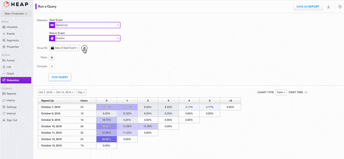
Heap's conversion window selector.

New Retention Views

Retention reports are powerful, but can be harder to interpret for many users than graphs. We’ve made two big changes that help insights shine in retention reports.

Cohortless Retention

Removing cohorts lets you look at your retention data aggregated across all users. This lets you remove noise from the data and get a clearer picture of your retention efforts.

Removing cohorts in Heap lets you look at your retention data aggregated across all users.

Retention Curves

Retention charts can still be hard to read at-a-glance, however, which is why we’ve built retention curves. Curves are easier to interpret when you’d just like to compare a few cohorts.

Graph of retention in Heap.

Combined with cohortless retention, it’s even easier to measure your app’s stickiness.

Heap's retention curve report.

Try It Out

Log into Heap to try out these new features with your own data. Not yet using Heap? Sign up for a free trial—installation only takes a few seconds.

Jonathan Archer

Was this helpful?
PreviousNext

Related Stories

See All

  • Creative visualization of AI CoPilot capability
    article

    Heap announces new generative AI CoPilot

    Heap, the leader in product analytics, unveils AI CoPilot’s open beta today.

  • Heap.io
    article

    What’s Next in Experience Analytics?

    What does the future of analytics hold, and what does it mean for you?

  • Heap.io
    article

    Building a Retention Strategy, Part 2: Connecting Activities to Revenue with a Metrics Tree

    If you read one post from this series, it should be this one.

Better insights. Faster.

Request Demo
  • Platform
  • Capture
  • Enrichment
  • Integrations
  • Governance
  • Security & Privacy
  • Infrastructure
  • Heap Illuminate
  • Segments
  • Charts
  • Dashboards
  • Playbooks
  • Use Cases
  • Funnel Optimization
  • Product Adoption
  • User Behavior
  • Product Led Growth
  • Customer 360
  • SaaS
  • Retail and eComm
  • Financial Services
  • Why Heap
  • Why Product Analytics
  • How Heap Works
  • How Heap Compares
  • ROI Calculator
  • The Future of Insights
  • Resources
  • Blog
  • Content Library
  • Events
  • Topics
  • Heap University
  • Community
  • Professional Services
  • Company
  • About
  • Partners
  • Press
  • Careers
  • Customers
  • DEI
  • Support
  • Request Demo
  • Help Center
  • Contact Us
  • Pricing
  • Social
    • Twitter
    • Facebook
    • LinkedIn
    • YouTube

© 2025 Heap Inc. All Rights Reserved.

  • Legal
  • Privacy Policy
  • Status
  • Trust