Data-Informed
Building a Retention Strategy, Part 2: Connecting Activities to Revenue with a Metrics Tree
If you’re concerned about developing an effective retention strategy, this series is for you. In this and future posts, we’ll walk through the key ways to use data to make sure you’re building a smart, scalable retention motion. Most will also include worksheets you can download and use with your team.
In Part 1, we showed you how to establish your Active Usage Metrics in order to figure out which actions, behaviors, and events in your product equate to value for your business. If you haven’t filled out the worksheet yet, do that first, because we’ll need that info to proceed with this step.
To get the pdf worksheet for this post, click here, or download the Google Doc.
Now you’ve got your Primary Usage Metric. Good job!
Our next step is to connect them to your ultimate goal—revenue. The best way to accomplish this is to create a “Metrics Tree.” In this post, we’ll explain what a metrics tree is, and how to create them.
So, what the heck is a metrics tree?
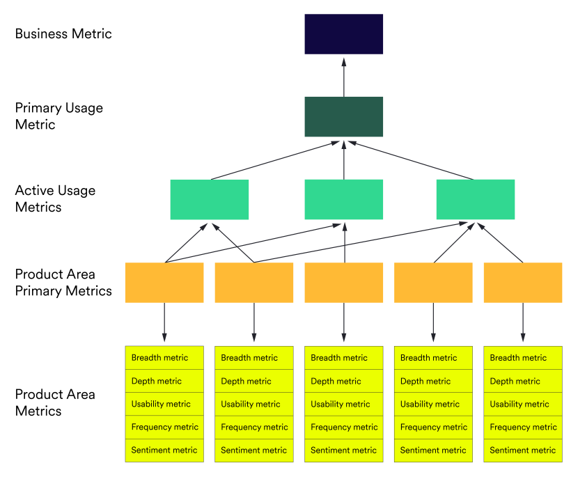
It’s a simple visual hierarchy, similar to a flow chart, that maps the relationships between your business KPIs. At a glance, you can see your #1 goal and a breakdown of all of the supporting (and resulting) metrics that influence it.
Why create metrics trees?
At bottom, a metrics tree is your hypothesis about how the actions users take in your product or digital experience ladder up to overall business impact. Without a metrics tree, it’s difficult to understand how different interventions in your product - changing a user flow, making a feature more obvious, even introducing a new set of features - might modify the overall success of the product, or produce the behaviors that lead to retention.
With a metrics tree, it’s much easier to choose between different potential interventions. (We’ll cover how to do that in the next post!) Or to understand which user behaviors tend to make money for the business, and how.
In essence, a metrics tree lets you clearly see how different parts of your product impact your goals as a business. And since this series is about retention, making a metrics tree is critical for making data-driven decisions about how to improve it.
The three basic tiers to creating a metrics tree are:

1. Identify a critical outcome
This is the star on top. This is typically a metric related to the business, such as revenue, cost, or margins.
2. Break this down into its component metrics
These are the branches. They tend to be product metrics like conversion, churn and adoption rates.
3. Reduce those component metrics into user actions in your product
These are the leaves. (Or needles, since we’ve got you thinking of a holiday tree). These are actions that serve as the leading indicators of those product metrics, such as feature adoption, trial conversion, and referral rates.
In any case, done properly, everything will ladder up to the star on top of the tree. As simple as this metaphor is to understand, it can be tricky to get it right.
IMPORTANT: Leading indicators will not always roll up neatly towards a single metric.
Sometimes your tree can have a gnarly trunk, with different metrics rolling up to multiple metrics above them. It can be tricky!
By putting together a metrics tree, you’ll be set up to answer questions like:
Where are people relying on one feature, but ignoring others?
Where are people using all of the available features, but not deeply?
Which features are being overlooked entirely?
Which of these things matter for overall revenue, whether that’s retention, conversion, upsell, or something else?
When you understand these, you’ll know which features to work on to encourage users to take next steps.
Ok, let’s dig in!
The Metrics Tree Workshop
As with our previous post, this doesn’t have to be done as a workshop. You can do all of this work asynchronously, or spread across a few weeks. But a workshop can be a good motivation for getting a rough draft together.
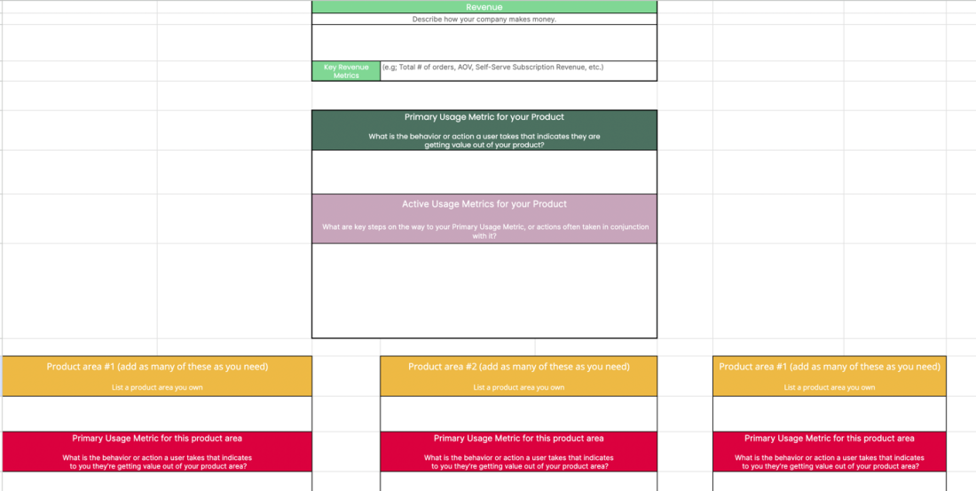
As before, we’ve made a worksheet that can help. Feel free to download it here! Or use this Google Doc - make a copy and use it with your team.

Your goal in this workshop:
Figure out the top three levels of your metrics tree, and come up with good hypotheses about the fourth and fifth levels.
How to do this:
We’ll be doing this by going level by level. Let’s start at the top!
Step 1: Revenue and where it comes from
Simply put, describe how your company makes money.
Single orders or subscriptions?
Who pays you and how do they pay?
What items do you sell, and what sells the best?
How granular you want to go is up to you. Since this series is about retention, the key metric you might want to put here is retention rate. What percentage of users stick around every year? How much do they pay to do so?
Step 2: The Primary Usage Metric for your product
Hooray, you’ve done this already! (Haven’t you?)
These are the answers from the worksheet in Step 1.
Step 3: Figure out the Active Usage Metrics for the product as a whole
Time to do some more brainstorming! Here you want to come up with actions in your product that aren’t your primary usage metric, but that are steps along the way to taking that action, or actions often taken in conjunction with that primary usage metric.
For example, if your product is an audio app, the primary usage metric might be “time spent listening.” But that’s not the only metric that indicates activity in your product! Other ones might be artists searched for, playlists saved, or songs shared. These are other actions that indicate getting value. They’re also potential sites of intervention: actions you might try to influence, knowing that they can influence your Primary Usage Metric.
Some other examples here:
Music streaming platform (e.g. ‘Spotify)
Time spent listening
1. Increasing the frequency at which users return to the app
2. Increasing the amount of time spent listening per session
Product Analytics SaaS (e.g. Heap)
Weekly querying users
Financial services app (e.g., eTrade)
Customer transactions completed
1. Increasing the number of customers who connect an external account
2. Decreasing time required to complete a single transaction
Business messaging platform (e.g. Slack)
Daily active users
Social media platform (e.g., LinkedIn)
Monthly active users
1. Increasing daily engagement with push notifications
2. Increasing the number of connections/links per user
CRM platform (e.g. Hubspot)
Weekly active teams
Step 4: Figure out the Primary Usage Metric for your product area
Now it’s time to get a little more specific. If you own a specific product area, you’ll want to figure out the Primary Usage Metric for it. If needed you can repeat the workshop you went through in Part 1 of this series. Or you can do something a little more informal.
The main goal here is similar to that from Part 1: figure out what action most indicates getting value from your product area.
What behaviors or actions does a user take that indicates they are getting value?
Which single behavior or action is the MOST impactful?
Step 5: Leading Indicators of Value
We believe in the idea of 5 Core Metrics as main categories to measure in your product area. Here is where you start brainstorming again—the goal is to come up with metrics that capture each of these for each area in your product:
(1) Breadth: How many people use your product?
Breadth considers the total number of users that you have, as well as the number of users per account. Look at adoption of your product and specific features in your product (for example, in how many accounts was a particular feature activated?)
Breadth = Number of current users ➗number of potential users.
A subcomponent of breadth is discoverability—are users actually finding the target feature? If not, you might consider changes that make the feature more discoverable, like in-app guides or a tour video.
(2) Depth: How much of your product are customers using?
Depth is the number of product features or areas that are used by the average person or account. This describes the level of engagement that users have with all of the features that you offer.
Take Amazon for example. Basically, Amazon sells stuff, but people enter many deeper levels of engagement with product features like creating wish lists, reading recommendations, leaving reviews, etc.
(3) Usability: Where can you streamline the experience?
Usability is the amount of effort it takes to get things done in your product. Sometimes measuring this can be as simple as tracking completion rate—are users able to successfully perform a task from start to finish?
(4) Frequency: How often do users engage within a given time period?
Frequency will tell you if your product or feature is providing repeatable value for users—and whether you’re likely to retain them. Is your tool something that users can’t live without?
Frequency is often overshadowed by activation as a leading indicator of retention, but it’s the best measure of how likely users are to keep coming back.
(5) Sentiment: How do users really feel about the product experience?
Some things about customers can’t be expressed in numbers. With sentiment, there’s more to the story than the data can tell you. For example, a product may sell well, but that doesn’t necessarily indicate users are happy and enjoy using it.
Whooo! That’s a lot to take in.
But we’re going to make it simple to execute on the attached worksheet.
Now you have a metrics tree for your area of concentration.
This is great! You can see which levers you can move to influence retention. You can also see which actions have the greatest impact, and—most importantly—how they affect other motions. You can still hypothesize about activities that may get people to stick around, but now you can know if those hypotheses are working, and why.
In the next post, we’ll talk about how to predict the relative impact of different interventions at the bottom of the tree.
This is how you put data to work informing your retention efforts!
Getting started is easy
Start today and elevate your analytics from reactive reporting to proactive insights. What are you waiting for?
