Garbage In, Garbage Out: How Anomalies Can Wreck Your Data
A 1960 census reported a shocking fact: several teenage women across the United States had 12 or more children each. These were women aged 19 or younger who already had massive families.
As it turns out, this never happened. The truth was that the data had been fabricated.A later study showed that between 3 – 5% of government census-takers engaged in some fabrication, sometimes yielding nonsensical results when they got sloppy.
Flawed census data is used every year to build scientific models, do in-depth analysis, and even make large-scale policy decisions. If the data backing up a model is wildly inaccurate, then our model is useless. That is: “garbage in, garbage out.”
This incident is an example of a wider issue in data analysis: anomalous data, or data that contains errors. Let’s look at a couple more examples, and how data visualization can catch these errors.
Outliers vs Anomalies
The census example above illustrates the distinction between outliers and anomalies in your data. An outlier is a legitimate data point that’s far away from the mean or median in a distribution [1]. It may be unusual, like a 9.6-second 100 meter dash, but still within the realm of reality. An anomaly is an illegitimate data point that’s generated by a different process than whatever generated the rest of the data. Let’s take a look at another example of anomalous data.
Researchers from the University of Vienna looked at several recent national elections for evidence of fraud. They used a dataset of district-by-district election results in many countries.
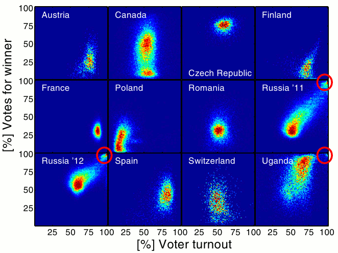
Looking at the raw data to find fraud is rather difficult. There are thousands of electoral districts in each of these countries, and tampering with the results of just a few might be enough to swing an election. But when they visualized the data, anomalies were easy to spot. They plotted voter turnout vs the percentage of votes that went to the winner:

In most countries with fair elections, we see a neat cluster centered around a certain voter turnout and winning vote level. Canada shows two different clusters, which is explained by a sharp divide between Québécois and English Canada.
But the really interesting elections were in Uganda and Russia. In these elections we see a small but distinctive cluster in the upper right corner. This corresponds to almost 100% voter turnout and 100% of the district’s votes going to the winner. While that fact alone is already quite implausible, the visualization demonstrates that these districts are anomalous as well. It’s a pretty strong case for election fraud.
This is a great example of anomalous data. While the majority of the dataset was produced by one process (legitimate voting data), a small subset was produced by a different process (fraud).
Less Obvious Anomalies
Not all anomalous data sits far outside the rest of the distribution. Every year, Polish high school students take a standardized “Matura” exam that’s similar to the SAT in the United States. Like the SAT, there are language and math components. Here’s the distribution of scores for the math portion of the 2010 test:

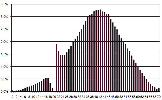
It looks pretty even. There doesn’t appear to be anything unusual going on. But the language score distribution looks different:

There’s a massive spike of students who got exactly 21 – 22, and sharp dropoff at 18 – 20. As it turns out, 21 was the passing score that year. The reason we see such an odd distribution is due to the grading process.
Each exam is graded based on a strict key. But after each exam has been graded, there’s a committee that reviews the exams a final time. The committee often finds ways (consciously or not) to give borderline students a few extra points. This is possible on the somewhat subjective language exam, but impossible on the math portion.
With the election data, we might be able to toss out the fraudulent districts and use the rest of the distribution to get a true picture of the elections. But here it’s not so simple. A lot of the 21 and 22 scores were legitimate, and due to the subjective nature of the exam it could be argued that they all were. Still, to do useful analysis on this data, we can look at the overall distribution and get a good idea of what the score distribution at 18 – 22 “should” be.
Lessons Learned
Understand your data before you use it to drive decisions.
Data scientists spend a lot of time thinking through the methods they use to analyze their data, but often don’t spend enough time auditing the data itself.
Visualization is a powerful tool for detecting problems with data.
If we’d just looked at the raw data, or summary statistics like mean or median, then we might have missed data quality problems in the examples above (especially the last one). Visualizing the data in the right ways made problems immediately apparent.
In isolation, a single anomalous data point can look reasonable.
Some anomalies only show up on an aggregate basis. In the Polish exam data, every anomalous data point looked identical to a valid one, until we looked at the entire distribution.
Have other examples of anomalous data? Let us know!
Notes
[1] Outliers don’t have to be far away from the mean or median of a distribution. It’s possible for a multidimensional dataset to have multivariate outliers, or outliers that only appear strange when looking at multiple dimensions. These aren’t necessarily far away from the mean / median of any single dimension.
