Anscombe's Quartet, and Why Summary Statistics Don't Tell the Whole Story

Let’s say we’re looking at a spreadsheet of our customers. We have data about how many times they’ve logged in, how much revenue we’ve earned from them, etc. We can immediately calculate several compelling summary statistics: what’s the average number of logins per customer? What’s the average revenue?What’s the correlation between number of logins and revenue?Summary statistics allow us to describe a vast, complex dataset using just a few key numbers. This gives us something easy to optimize against and use as a barometer for our business.But there’s a danger in relying only on summary statistics and ignoring the overall distribution. We took a look at this earlier as it relates to average revenue per user. In this article, we’re going to dive deeper into how summary statistics can be misleading. Calculating summary statistics, while useful, should only be one piece of your data analysis pipeline.
Anscombe’s Quartet
Perhaps the most elegant demonstration of the dangers of summary statistics is Anscombe’s Quartet. It’s a group of four datasets that appear to be similar when using typical summary statistics, yet tell four different stories when graphed. Each dataset consists of eleven (x,y) pairs as follows:
I II III IV
x y x y x y x y
10.0 8.04 10.0 9.14 10.0 7.46 8.0 6.58
8.0 6.95 8.0 8.14 8.0 6.77 8.0 5.76
13.0 7.58 13.0 8.74 13.0 12.74 8.0 7.71
9.0 8.81 9.0 8.77 9.0 7.11 8.0 8.84
11.0 8.33 11.0 9.26 11.0 7.81 8.0 8.47
14.0 9.96 14.0 8.10 14.0 8.84 8.0 7.04
6.0 7.24 6.0 6.13 6.0 6.08 8.0 5.25
4.0 4.26 4.0 3.10 4.0 5.39 19.0 12.50
12.0 10.84 12.0 9.13 12.0 8.15 8.0 5.56
7.0 4.82 7.0 7.26 7.0 6.42 8.0 7.91
5.0 5.68 5.0 4.74 5.0 5.73 8.0 6.89
All the summary statistics you’d think to compute are close to identical:
The average x value is 9 for each dataset
The average y value is 7.50 for each dataset
The variance for x is 11 and the variance for y is 4.12
The correlation between x and y is 0.816 for each dataset
A linear regression (line of best fit) for each dataset follows the equation y = 0.5x + 3
So far these four datasets appear to be pretty similar. But when we plot these four data sets on an x/y coordinate plane, we get the following results:

Now we see the real relationships in the datasets start to emerge. Dataset I consists of a set of points that appear to follow a rough linear relationship with some variance. Dataset II fits a neat curve but doesn’t follow a linear relationship (maybe it’s quadratic?). Dataset III looks like a tight linear relationship between x and y, except for one large outlier. Dataset IV looks like x remains constant, except for one outlier as well.
Computing summary statistics or staring at the data wouldn’t have told us any of these stories. Instead, it’s important to visualize the data to get a clear picture of what’s going on.
A Real-World Example
Let’s look at a real dataset that shows exactly how summary statistics can be dangerous.
A great example is the distribution of starting salaries for new law graduates. The National Association of Law Placement (NALP) reports that in 2012, lawyers made $80,798 on average in starting salary. However a look at the salary distribution shows what law salaries really look like:
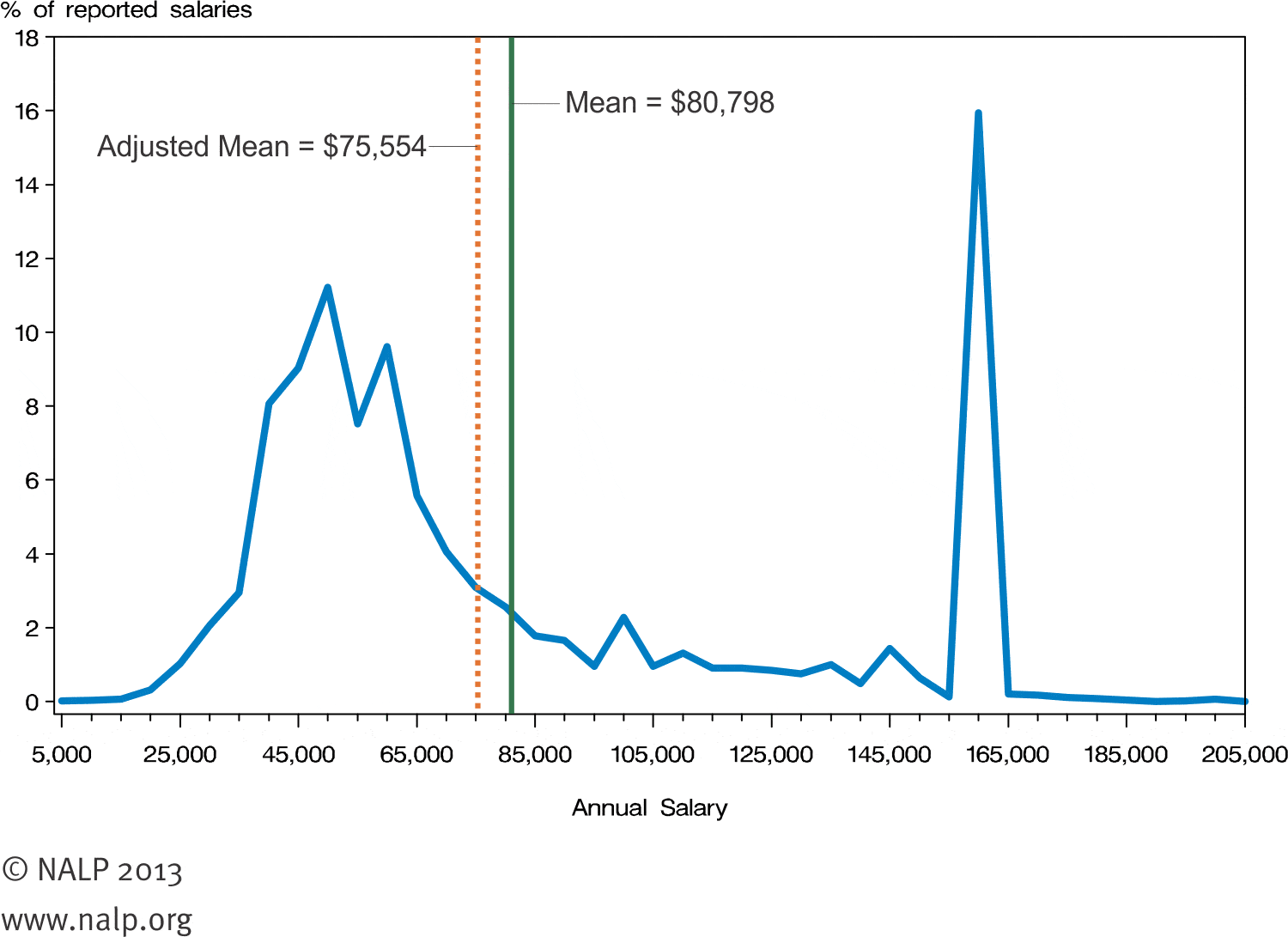
It turns out that law graduates usually fall into one of two groups. The majority of new lawyers make somewhere between $35,000 and $75,000 per year, and a sizable minority earns $160,000 per year. What we have here is a bimodal distribution: there are two peaks that arise from two distinct distributions happening within the same dataset. The $80,798 figure reported as the average falls into the trough between the two peaks, and few lawyers have salaries near that number. A much more accurate statement would be that most law graduates make around $50,000 on average, and those who go to one of the top law schools make $160,000 on average.
There’s also something else happening here that we wouldn’t have observed if we hadn’t plotted the data. There’s a giant spike at exactly $160,000 in starting salary, rather than a peak with some variance. Why is $160,000 such a popular number for law salaries? As it turns out, this data isn’t based on actual legal salaries, but based on what law schools report to the NALP as their students’ median starting salaries. There’s a lot of skepticism about the $160,000 figure, and third-party data shows that the distribution might not be so skewed.
Visualizing the data helped in two ways. It gave us a better picture of what realistic starting law salaries look like, and also allowed us to ask a follow-up question that exposed a potential flaw in our data.
When should you use summary statistics?
This isn’t to say that summary statistics are useless. They’re just misleading on their own. It’s important to use these as just one tool in a larger data analysis process.
Visualizing our data allows us to revisit our summary statistics and recontextualize them as needed. For example, Dataset II from Anscombe’s Quartet demonstrates a strong relationship between x and y, it just doesn’t appear to be linear. So a linear regression was the wrong tool to use there, and we can try other regressions. Eventually, we’ll be able to revise this into a model that does a great job of describing our data, and has a high degree of predictive power for future observations.